Can They Read It? 7 Email Design Tips For Readability
If you’re sending emails to your customers, you know you have lots of choices when it comes to the design. Colors, font, images, copy, and buttons are just some of the customizable pieces you have control over as you design an email.
But what comes with all of this creative control? The opportunity to pick the best option for the most readers (and yes, some options are better than others).
Let’s go over seven email design practices to make sure your message is as readable and functional as possible (and yes, also pretty). ✨
1. Our Biggest Design Tip: Don’t design an email as all one image (or multiple images) and no text.
Our #1 design “don’t” (and a huge pet peeve when we see it) is when an email is all one big image, or several small images all next to each other.
The biggest reason for not putting all of your email in an image? Accessibility.
We understand thinking that it’s easier or allows for more design control to just use images, but having all of your content in image format makes your message impossible to read if it doesn’t load or the recipient uses an email reader (for people with a visual disability).
If your message is in your email as text, it’s much more likely to be read by more people of all abilities (and load faster!).
The best practice is to balance text with some images and visual elements throughout the email, which we’ll talk about more later. ⬇️
Pro Tip: Accessibility is more and more important to businesses — as it should be, since you could be missing out on reaching people with disposable income who might want to buy from you. Plus, studies have found that improving accessibility helps overall business goals, like retention, reputation, and revenue.
2. Keep the email simple.
You may feel like you need to fill your email with lots of colors, lots of images, and all of your offers or products. You want to catch people’s eye, after all.
Good news: you don’t need to! It’s actually best to keep the design of your emails simple.
- Pick one or two brand colors to use as accent colors. Try them in headers and on links and call-to-action (CTA) buttons.
- Include just one offer or product to promote per email.
- Simple formatting includes one full-width header image, a main heading (a.k.a. an H1), some copy, and a button either close to the header image or below your main content.
Keeping things simpler means they’ll be more likely to look the same across all devices — so there won’t be something wonky on that random Safari browser or Outlook inbox.
3. Make the email mobile-friendly.
How often do you check email on your phone? Research says 85% of users use smartphones to check their email. Make sure those readers can read and interact with your email clearly on phones just as well as on a laptop!
This means making sure your CTAs are big enough to easily tap with your thumb or finger, and using mostly single-column formatting when building your email. (This is how most emails are formatted on mobile devices anyway, and it loads quicker.)
Most email tools have a way to preview emails on mobile, or you can send a preview version to yourself to check on your phone. Don’t forget to do this before you send out the email to the masses.
4. Make the email accessible to all.
Hi, more accessibility tips here! (Because it’s important.)
To make sure everyone can understand your message and interact with your email — no matter what their physical or mental constraints — there are a number of things to keep in mind, but here are a few that we stress related to design.
- Keep the font size big enough. Anything below 14 pt font is too small for many readers, especially if they have limited vision. We suggest using 14-16 pt for the main copy.
- Use good color contrast so people with color blindness or in bright sunlight can easily see what’s on the screen.
- Make CTAs clear and visible. Give plenty of room around buttons or CTAs and be descriptive with the text so people know exactly where the link goes.
5. Balance visuals with text.
Images, videos, and GIFs are great ways to keep readers engaged in your email, but remember to keep visuals and text balanced.
An email with all text might not get many clicks, but an email with all images isn’t readable to those with images turned off or has software reading the email to them (as we mentioned in tip #1).
Another (very important) reason to not have too many images in an email is to keep email servers from thinking you belong in the spam folder.
Pro tip: While you’re adding visuals, make sure you include alt text. This text will let people know what the image is if the image doesn’t load or they can’t see it.
6. Include white space throughout.
Have you ever gotten an email where the text and images were all squishedtogetherwithnospacebetween?
Or one full of long, drawn-out paragraphs that were 20 lines long with nothing to break it up?
It doesn’t look very good and definitely isn’t very readable.
Space things out. Let your copy and images have some breathing room to keep things clean and easier to digest for your recipient.
Most email tools have a spacer-type insert that will add space between text or images, and while you don’t have to use double-spaced formatting for your main text, single-spaced lines can be more difficult to read on mobile. (Reminder to check a preview of your email on mobile before sending!)

7. Pick the right font.
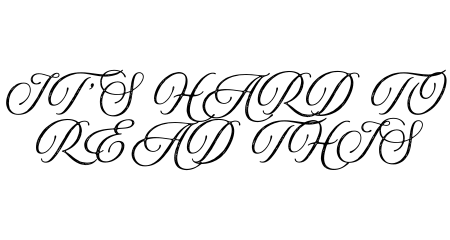
The right font is an important design choice for email, where the goal is for someone to read what you wrote. They need to be able to read that text! (Can you tell what it says up there? 👆)
Fonts like Arial, Open Sans, and Times New Roman are always safe options, but if you’re looking for more font ideas that everyone can read, check out this list.
Bonus Tip: A/B test your design choices.
An A/B test for email is when you make two versions of the same email with one thing different between the two.
Most email tools have this as a feature, and it’ll then split your send list in half, sending version A to one half and version B to the other half. From there, you can see which version got more clicks and what your send list prefers.
Some design elements you can test are:
- CTA placement or size
- Link color
- Still images vs. GIFs
- More copy vs. less
We recommend running these tests a few times with multiple different email sends to get clear results.
Enjoy Email Excellence with 9 Clouds
By following these email design tips, your emails will be both eye-catching and also easy to read and interact with, no matter what device your audience is using.
And hey, if you ever find yourself needing a hand in getting more out of your email marketing, talk to us. With our help, you’ll have the team and resources to send out emails that truly stand out and get results.
Win the Inbox With Email Marketing »


