Web Design for SEO: 14 Dos and Don’ts
So, you’ve got a pretty site. Awesome! But is it built to show up in search results?
Your website should be designed with SEO in mind from the start. For most people, it’s their first impression of your brand. And let’s be honest, people really do judge a book by its cover.
A clean, easy-to-use site doesn’t just make you look more professional, it also helps search engines understand your content so you can show up where it matters.
Here’s a breakdown of what to do (and what to avoid) if you want a site that looks sharp, loads fast, and actually gets found online.
SEO Design ‘Dos’ for Better Rankings

1. Keep Your Color Palette Simple
A clean, consistent color scheme doesn’t just make your site look good — it makes it easier to read and navigate. Strong contrast helps visitors quickly understand where to go and what to click, which keeps them around longer.
Pro Tip: Choose colors that fit your brand, but don’t forget about accessibility. Make sure there’s enough contrast between your text and background, and don’t rely on color alone to communicate important information. Keep your palette simple and consistent so your site is easy for everyone to read and navigate.
2. Use Clear and Compelling CTA Buttons
Your call-to-action (CTA) buttons are the MVPs of your site. They guide users to take the next step, and when users interact with your site, search engines notice. The key is giving people a reason to click, not just telling them to click.
Pro Tip: Make your CTAs about what’s in it for the user. Instead of a generic “Learn More,” try something like “See Our Services” or “Find the Right Plan for You.” Use clear, benefit-focused language that tells visitors what they’ll get when they click and makes the next step feel worth taking.

3. Always Pick High-Quality Images
Great images aren’t just eye candy. They make your site more engaging and can help keep visitors around longer, which is a win for SEO.
But watch out: large image files can slow down your site, creating a frustrating experience for users and making it harder for search engines to crawl and rank your pages.
Pro Tip: Use images that actually add to your content and look sharp. Compress them to keep your site running quickly, and always include descriptive alt text to make your images more accessible and help search engines understand what they show.
4. Use Easy-to-Read Fonts and Appropriate Font Sizes
The fonts you pick can have a big impact on how easy your site is to read. When your text is clear and comfortable to read, visitors can find what they need without having to squint, zoom, or work for it. And when your site is easy to use, that’s a win for both users and SEO.
Pro Tip: Choose clean, easy-to-read fonts for your body text and save more decorative fonts for headings or accents. Keep your text large enough to read comfortably, with 16px or larger generally being a good starting point. Don’t forget about line spacing and contrast, too!
5. Have a Clean and Structured Layout
A tidy layout helps visitors find what they need without having to dig through a wall of content. It also helps search engines understand how your page is organized and what information matters most.
Pro Tip: Keep your content organized and easy to scan.
Use clear headings: Use H1, H2, and H3 headings to break your content into logical sections. Use one H1 to clearly communicate the main topic of the page.
Embrace whitespace: Give your content room to breathe so your site doesn’t feel cluttered or overwhelming.
Break up big blocks of text: Use shorter paragraphs, bullets, and other easy-to-scan sections to keep things easy on the eyes.
Write for people and AI: Think about the questions your audience is asking and provide clear, concise answers. This makes your content easier for both people and AI tools to understand, pull from, and surface in answers.
6. Design with Visual Hierarchy in Mind
Visual hierarchy helps show visitors what’s most important on your page. When key information stands out, it’s easier for people to find what they’re looking for, understand your content, and take the next step. And when your site is easy to use, that’s a win for SEO, too.
Pro Tip: Play with size, color, spacing, and placement to make your most important information pop. Put the spotlight on the things you really want visitors to notice, like your main message, important details, or CTA.
7. Optimize for Accessibility and Mobile Friendliness
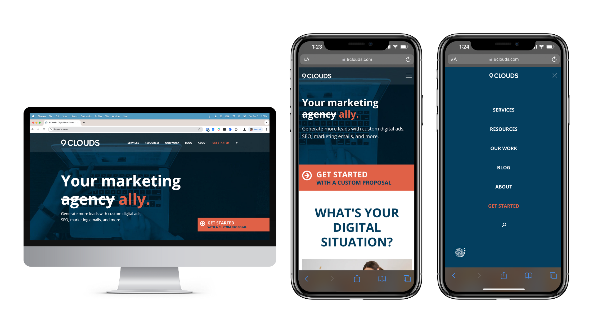
Making your site accessible and mobile-friendly isn’t just about being nice. It helps everyone, including people with disabilities, use your site. It’s important for SEO, and in some cases, it’s legally required. If your site isn’t accessible, you could miss out on traffic or even run into legal trouble.
Pro Tip: Use responsive design so your site adapts to different screen sizes, and test it on phones, tablets, and desktops to catch any issues. Make sure things like text, buttons, navigation, images, and forms are easy to see and use for everyone.
8. Write Clear, Descriptive URLs
A clear, descriptive URL gives users and search engines a quick idea of what a page is about before they even click. It also makes your links easier to read, remember, and share.
Pro Tip: Keep URLs short, simple, and descriptive. Use relevant words when they naturally fit, and avoid unnecessary numbers, symbols, or long strings of text that make your URLs confusing to read.
9. Add Internal Links
Internal links are like a roadmap for visitors and search engines, helping everyone explore your site and find related content. They also help search engines understand how your site is organized, how your pages relate to each other, and which pages are most important.
Pro Tip: Link to relevant pages when it makes sense, and use descriptive anchor text that tells visitors what they’ll find when they click. Good internal linking helps people discover more useful content while giving search engines more context about your site.
SEO Design ‘Don’ts’ for Better Rankings
1. Do Not Go Overboard with Color
Too many bright or clashing colors can make your site hard to look at and even harder to navigate. When everything is competing for attention, it’s tough for visitors to know where to look or what to click.
Pro Tip: Keep your color palette simple and use your brand colors intentionally. Use contrast to draw attention to important elements, like CTAs or key information, without making every part of the page fight for attention.
2. Do Not Use Graphics Just for the Sake of It
Not every page needs a photo, graphic, or decorative element. Random or low-quality visuals can distract from your content, make your site feel cluttered, and take up valuable space without adding anything useful.
Before adding a graphic, ask yourself, “Will this help the user understand something, find something, or take action?” If the answer is no, you probably don’t need it.
Pro Tip: Choose visuals that support your content or make the user experience better. If you don’t have custom photos, choose high-quality, relevant images that feel professional and on-brand rather than adding something just to fill space.
3. Don’t Overload Pages with Text
Huge blocks of text can overwhelm users and make your content harder to digest. If visitors have to work to find the information they need, they’re more likely to bounce.
Pro Tip: Break up long paragraphs into smaller chunks and use bullet points, subheadings, and short sentences to make your content easier to scan. Clear, organized content is easier for people to read and easier for search engines and AI tools to understand and pull from.
Want to make your content easier for AI to understand, too? Check out our blog about adapting your SEO strategy for AI-powered search to get tips on structuring your content to work better for both people and AI.
4. Don’t Cram Too Many CTAs on One Page
Having five buttons screaming for attention all at once doesn’t help, it just confuses people. Too many competing calls to action can distract visitors from the main goal of the page and make it harder to know what to do next.
Pro Tip: Give your page a clear primary CTA and make it easy to find. You can still include additional actions when they make sense, but make sure they support the user’s journey rather than competing for attention. Guide visitors toward the next step naturally and make it clear what they’ll get when they click.
5. Don’t Upload Giant Image Files
Large image files can slow down your site, frustrate visitors, and make it harder for them to get to the information they’re looking for. Page speed is also part of the overall page experience Google considers when evaluating websites, so keeping your site fast is good for both users and SEO.
Pro Tip: Always compress your images before uploading them and choose the right file format for the job. WebP is a great option for many websites, while JPEG and PNG still have their place. Instead of aiming for one specific file size, focus on keeping images as small as possible without sacrificing quality.
6. Don’t Put Key Info Inside Images
Putting important information inside an image can make it harder for people and search engines to access and understand. Not everyone can see or interpret images easily, and text embedded in graphics isn’t as accessible or flexible as regular page content.
Pro Tip: Keep important information in regular HTML text whenever possible. This makes your content easier for everyone to access and gives search engines and AI tools clear, readable information to understand and pull from. If you’re sharing tables, statistics, or other important data, use HTML instead of an image to keep the information accessible and easy to find.
Ready to Improve Your SEO?
You don’t have to choose between good design and great SEO. Your website can look good, work well, and make it easy for both people and search engines to find what they need.
At 9 Clouds, we help businesses optimize websites that look great, provide a better user experience, and get found online. If you’re not sure where your site could use some improvement, we’ve got your back.
Feeling Stuck with SEO? Let Us Know.
Olivia Grinde
Passionate about blending creativity with data, Liv enjoys crafting compelling content that resonates with audiences in the ever-evolving landscape of digital marketing. Learn more about Olivia.