Email Trends to Keep in Mind
Not sure if email is worth the time or money anymore?
Let’s check some stats about email:
- 77% of marketers have seen an increase in email engagement in the last 12 months.
- By the end of 2024, email marketing revenue reached $12 billion.
- 93% of email users now check their inboxes every day.
Those are big numbers for such a cost-effective marketing strategy.
It’s also going to be one of the only marketing services with a specific advantage: low AI interference.
“Email stands as a fully distributed and decentralized communication mechanism that remains impervious to the control of any single company. This allows it to remain highly effective in directly reaching people, with minimal interference from the AI systems employed by others.”
Christopher Penn, Chief Data Scientist, TrustInsights.ai
Our team’s email specialists (like me!) have been keeping up with what your current email list wants you to know about sending emails — and we have three trends we think other email marketers will want to focus on going forward.
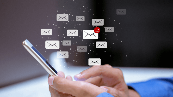
1. People are Checking Email on Phones
This one has been on lists for a few years, but if you’re sending emails, chances are most of them will be read on a phone rather than a desktop.
62% of all emails are opened on mobile — and that’s only going to increase.
Most email tools allow you to send preview emails before sending to your list and check how it looks on a phone. You should always do this before sending an email.
Check how things look on both computer and phone screens.
Even better? Check on different phone types, like Apple vs. Android, too! (Some email tools let you preview it on different screens within the tool itself, but it’s still good to double-check on the actual device.)
When checking those previews, make sure your image sizes and copy size are still as readable on a small screen as a wider screen. If someone on their phone sees that your email is not formatted for mobile, they are likely to delete it right away — 62% of them, actually.
2. People Engage with Moving/Interactive Elements
Interactive elements in an email have shown a 300% increase in click-through rate.
That’s wild!
And the more email tools and capabilities develop, the more interactive our emails will get.
When considering making your emails “more interactive”, we don’t just mean GIFs or animated text (though those are good, too).
Consider adding polls, surveys or game-like activities that really get the reader involved.
You might have seen discount spinners in emails where you spin a wheel for a certain discount or scratch-off animations for coupons to reveal hidden savings.
If you have a timely event or discount, include a countdown timer. These are great ways to get people clicking!
Take this chance to be creative with how your emails look and get your readers more engaged.
3. People with Different Accessibility Need to See Your Email, Too
An email should be able to be understood by all who receive it.
Make sure your emails are accessible. Roughly 1 in 4 adults in the U.S. live with some type of disability — but it’s not just about that.
It’s about making your emails understandable — because if a user has trouble viewing, clicking on or understanding an email you send, they won’t take the action you want them to.
Here are some must-dos when creating your emails and making them accessible:
- Use alt-text when you can, but use it correctly.
- Use font sizes that are at least 14 px (preferably 16 or higher), and space out your copy to make it more readable.
- Don’t just rely on color to differentiate or emphasize parts of your email.
- Make links and buttons clear about where they take users.
That last one is a big one for any email.
Don’t make any of your links or buttons say “click here.”
This is a best practice for any links — on websites or in an email — but it also helps accessibility. Those using a screen reader or just tabbing through content will not know what the “click here” is linking to, and they’ll probably skip it.
Always clearly state in your link or button copy what to expect when someone clicks or taps on that link.
Get Ready For More Email Opportunities
It’s not too late for your business to start using email to show up in the right inboxes.
If you’re trying to decide what email tool to choose, check out our blog on the team’s favorites.
Email can be affordable and simple to start with the right help. Whether you’re just starting or need some expert assistance improving your strategy, we’re here as your email marketing ally.
LEARN ABOUT EMAIL MARKETING WITH 9 CLOUDS »
Jordan Maxfield
As a senior digital strategist at 9 Clouds, Jordan builds results-focused campaigns for clients from all varieties of verticals. When she's not working on emails or digital ads, Jordan is watching movies or going on little road trips. Learn more about Jordan.