It’s Not a Trap: Making Clickable Call-to-Action (CTA) Buttons
A lot of us have trained ourselves to ignore ads, pop-ups, and anything we encounter online that looks too good to be true.
 That can be a hurdle for inbound marketers trying to get users to their landing pages. You don’t want anybody who’s surfing your site to feel like they’re dodging traps and pitfalls.
This is especially important when it comes to the call-to-action (CTA) button on your blog post or product page. Putting yourself in the shoes of your website visitors, do you trust what you’re clicking?
To make sure you’re nurturing leads instead of losing them with your offers, it’s vital to know what makes a compelling CTA that wins you clicks and conversions.
What Exactly Is a Call-to-Action (CTA)?
A call-to-action, or CTA, is an instruction or request to your audience to take action right in that moment — not after they’ve digested all the information on the page and mulled over any other clickable options. In that exact instant, you’re asking them to do something.
For online and inbound marketing, that usually means you’re asking a visitor to click something. So if I’m on your site, maybe you’re asking me to download an eBook on nurturing leads, or you want me to register for a webinar about advertising on Instagram. In any case, your goal is for me to click that CTA.
In the world of inbound marketing, it’s important to understand CTAs for a variety of aspects of your online strategy. For example, did you know you can use CTA buttons on Facebook?
To create a compelling CTA, you want some basic elements covered:
- Does it look clickable?
- Is there a clear value to the click?
- Is it the logical next step on your page?
A CTA button might look something like this:
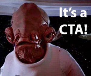
This CTA has a lot going for it because it stands out on the page. It also looks like something you can click. Back at the beginning of this post, you probably wouldn’t have guessed that clicking Admiral Ackbar will also bring you to a landing page about 9 Clouds doing an audit of your business’s online presence.
The text on that CTA button is a bit of a mouthful to read, though, and the wording is really about us taking action instead of you, right? So there’s room for improvement.
But what’s the biggest problem with that CTA?
Now isn’t a great time in the article for me to call on you to request a digital audit, is it? I haven’t told you anything about it, and there’s still plenty of text I want you to look at. Such as . . .
Where Should a CTA Go?
Location, location, location. Your call-to-action needs to stand out on the page and make sense in the context of your content.
Think of it this way: If I walk into a strange house where I don’t know anybody, I might be hesitant to drink anything that’s immediately offered to me. But after I’ve gotten my bearings and learned more about my surroundings, it would be much more reasonable for me to take a host up on some refreshments.
Inbound marketing works the same way. You don’t want to dive-bomb the average user with a CTA when they’re only halfway through the door. Good lead nurturing requires logical CTA placement so that visitors can be confident in what you’re offering.
Finding the perfect CTA placement takes some practice. Just remember that your CTA needs to feel like a natural next step for whoever is on your webpage.
If you’re wondering whether your pages are placing CTAs in the right locations, you may want to get a free digital audit from 9 Clouds. We’ll take a look at your site and, with no obligation from you, let you know what aspects could use improvement.
Here, it made sense to insert this CTA, because my offer directly tied into the content. We’re also far enough into the post that (hopefully) you’ve gotten a sense that we know what we’re talking about when it comes to lead nurturing and inbound marketing.
For those who continue reading the post, it’s a good idea to also include a CTA at the bottom of the page, in step with the conclusion.
What Should a CTA Look Like?
Design is a huge factor in whether or not a site visitor will make a conversion with your call-to-action. It’s vital to ensure your CTA grabs attention and looks clickable while clearly communicating value.
Luckily, it’s easy to draw the eye to something clickable. Your CTA just needs to stand out from the rest of the page, like the button above does.
You can also add a link that has a different color or an underline to normal copy, or you can use an anchor text CTA: a call-to-action that is set apart, demands attention, and serves in place of a button. Our friends at HubSpot recently published a great article on this type of CTA.
Here’s an example of an anchor text CTA:
>> Want better web traffic? Get a free evaluation of your company’s online presence! <<
While HubSpot is having success with anchor text, CTA buttons present a very clear offer to your audience in order to get them to engage in an action.
But you need to be clear to users that you aren’t feeding them junk. We’ve all groaned after seeing flashing pop-ups alleging that we’ve won a cruise, an Xbox One, and/or $10,000.
To set your real, quality offer apart from the trash, go for professionalism and confidence over flair. Your CTA design should fit in with your page’s aesthetic and appeal to your specific audience.
At 9 Clouds, you’ll usually see blue buttons like this that fit our company’s palate:
But it’s important to A/B test different CTA types and find what works best for you. The HubSpot team said the top two attention-grabbing colors are orange and green. So we might start trying out CTAs that look like this:
Which one do you feel more inclined to click?
Another vital aspect of a visitor’s decision to click (or not click) your CTA is the copy you use. For these last two buttons, I streamlined the message to make it clear what you’d get. But half the reason I could do that is because we’re farther along in the post, and you know more about the offer.
You might also play with whether your CTAs are left-justified, center-aligned, or right-justified. According to UX Movement, CTAs on the right (or closer to it) will convert better than those on the left, as we scan pages from left to right. But again, test to find what style is best for you.
However you decide to use CTAs — whether buttons, anchor text, in-line or even those with graphics — the main point is to have a call-to-action that encourages a conversion. Does it look clickable, and does it clearly communicate the value of your offer?
Once you’re using them successfully, CTAs will help you to grow your email list and increase engagement on your website.
Seeking some more guidance? Then, really, you should look at our offer to do a free digital audit of your company’s online presence.


